Redesigning a
campus staple
UCampus is an in-campus food ordering application at Chitkara University — designed to simplify locating and ordering from institutional food outlets. It serves students, faculty, staff, and visitors while promoting in-house food startups and reducing reliance on external delivery services.
The app had real problems. Users couldn't find outlets, the UI was confusing, and the ordering flow created frustration. In 2023, I undertook a complete redesign — starting with deep primary research and ending with a high-fidelity prototype tested with real users.
This is a complete end-to-end UX project: primary research, secondary research, surveys, stakeholder interviews, user personas, journey maps, low-fidelity wireframes, high-fidelity design, and usability testing.
- User interviews
- Google Forms surveys
- Play Store reviews
- Functional analysis
- Paper wireframes
- Information architecture
- User persona
- Journey map
- Visual conceptions
- Low-fidelity interface
- Design systems
- App architecture
- High-fidelity design
- User testing
- Feedback integration
- Final implementation
What was
broken
From Play Store reviews and direct user interviews, these were the five core pain points that defined the redesign scope. Real feedback from real students — not assumptions.
The design
process
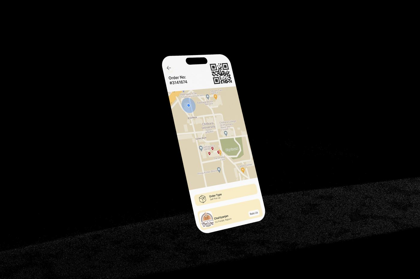
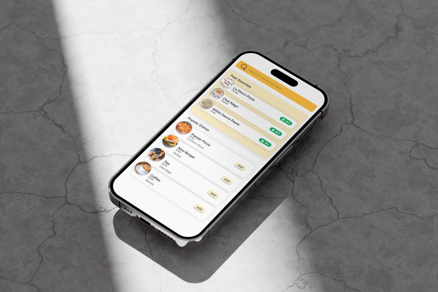
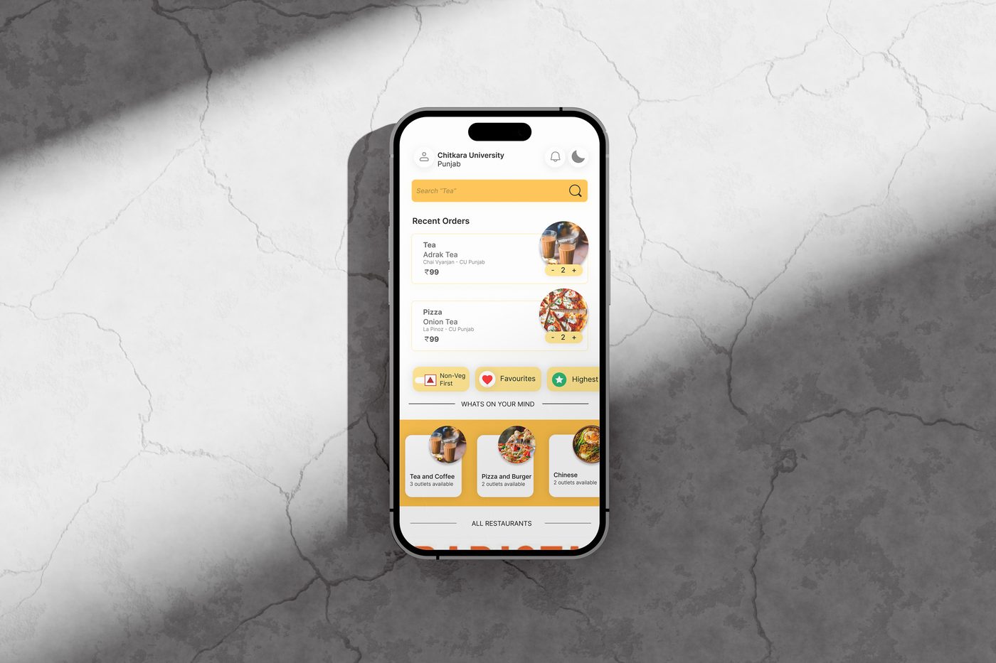
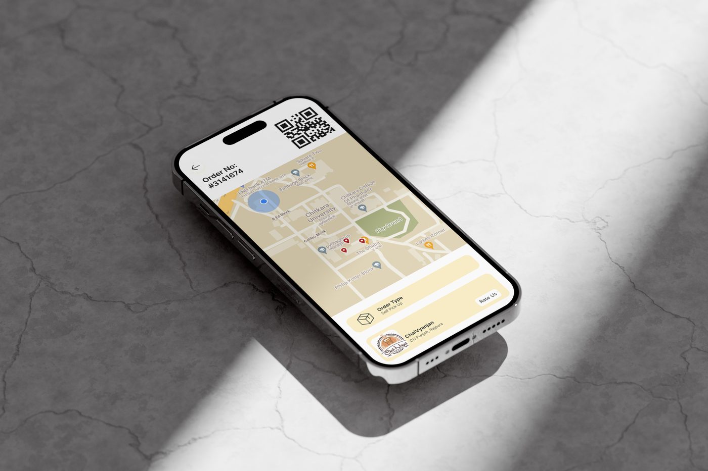
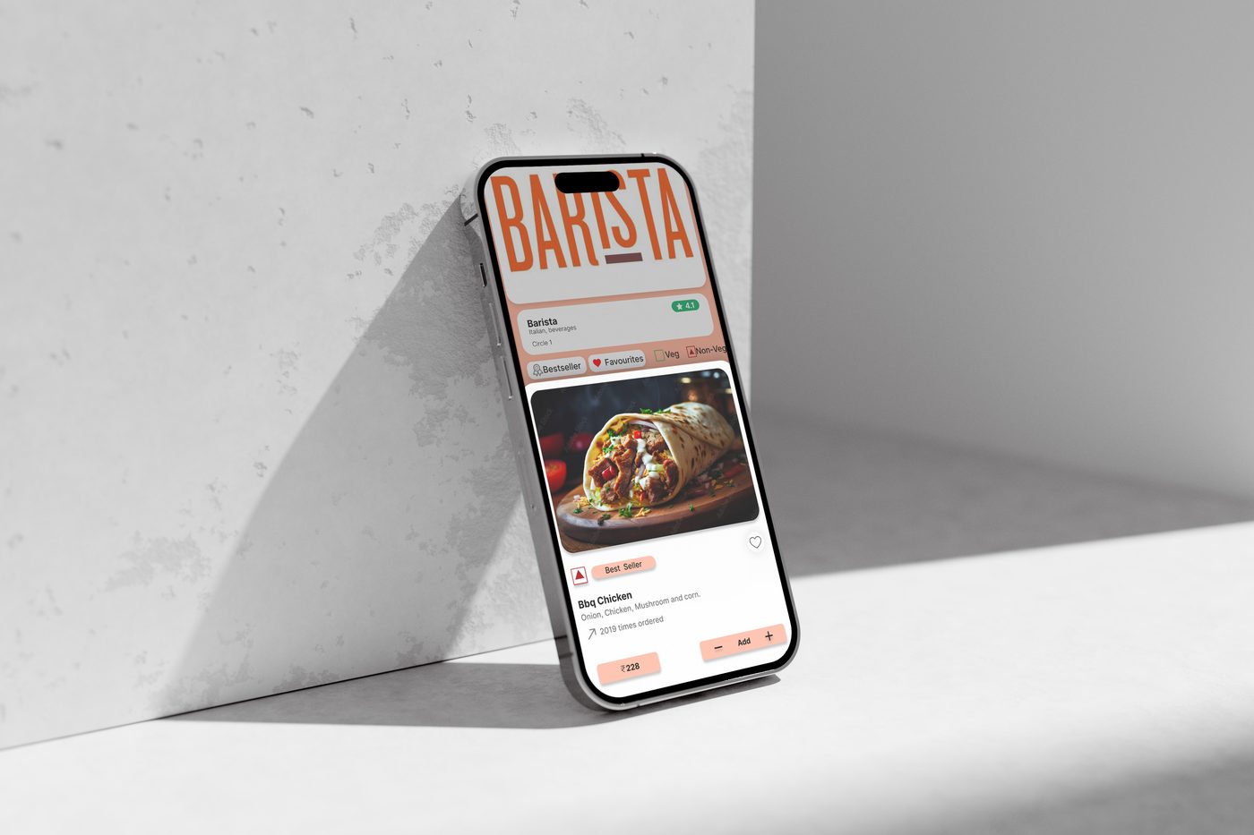
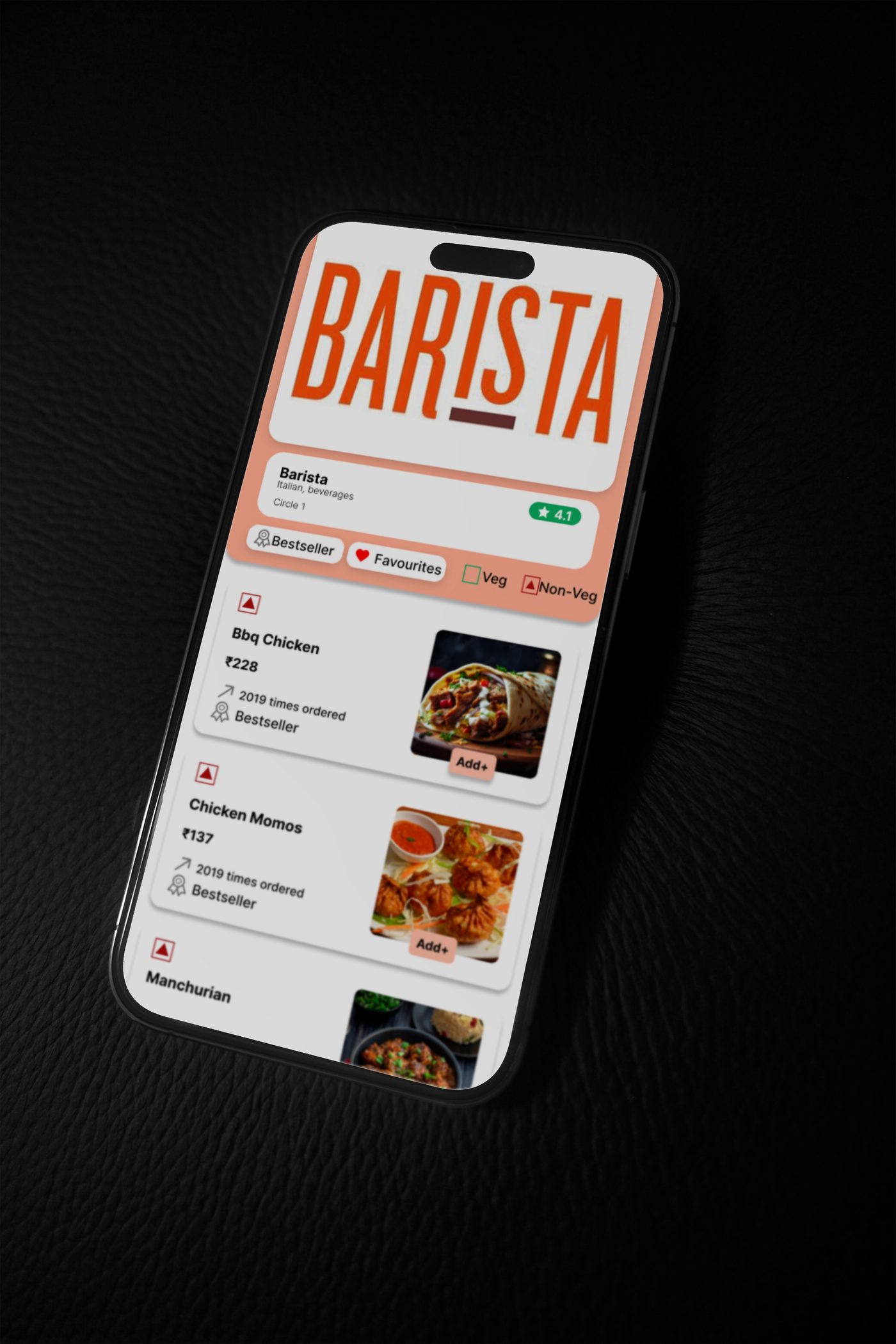
Key screens
From home to checkout — every screen was redesigned with a specific pain point in mind. Warm amber tones, clear typography, and an intuitive layout that guides users without effort.
What I delivered
Final outcome
This project was my most complete UX process to date. It proved that good design isn't aesthetic preference — it's disciplined research translated into interface decisions that serve people better than what came before.